

Read the Roland Barthes essay Rhetoric of the Image on pps. 33-40 of the course reader and make notes.
Notes on ‘Rhetoric of the Image’
In ‘Rhetoric of the Image’, Barthes asks whether images can be analysed in the same way as language and whether methods of semiology can be applied. The relationship between image and text and the nature of photographic truth, amongst other things, are also explored. He asks the questions: How does meaning get into an image? Where does it end? What is there beyond? For his analysis Barthes uses an advertising image for Panzani pasta sauce in order to submit the image to a “spectral analysis of the messages it may contain.” (Evans and Hall, 1999: 33) He chooses advertising because “in advertising the signification of the image is undoubtedly intentional”, any signs within the image are fully formed with a view to optimum reading: “the advertising image is frank, or at least emphatic.” (Evans and Hall, 1999: 34)
Barthes touches on many concepts within ‘Rhetoric of the Image’, below I have summarised some of this and how it has informed my approach to part two of this project which requires analysis of current advertisements.
The Three Messages:
Linguistic message:
This is the supportive text within the image/advertisement, usually in the form of captions, slogans and labels and is easily separated from the image itself. On the first level of signification (denotation) all that is required to understand is knowledge of the language employed. A second order of signification (connotation) can also be implied however. In the case of the Panzani advertisement, Panzani is not only the name of the firm but also suggests “Italianicity.” These romanticised/stereotypical connotations of what constitutes Italian culture are aimed solely at the French audience the advert is aimed at, Italians themselves would not recognise this. The linguistic message works on both a perceptual and cultural level.
Coded iconic message:
This is a symbolic message that works on the level of connotation. The reader must play a part in understanding the image by applying their knowledge of systematic coding to the image.
For the Panzani advert, Barthes asserts that even with all linguistic signs removed from the image we still continue to ‘read’ and understand what we are looking at as it contains identifiable, nameable objects.
Non-coded iconic message:
This works on the level of denotation – a photograph can be described as a message without a code, that is, we simply read the medium itself.
Barthes points out that it is easy to separate the linguistic message from the coded/non-coded iconic messages, however the difference between these is not so easy to separate as they share the same iconic substance. Also, the viewer receives both the perceptual and cultural message at the same time, in other words, the medium cannot be separated from the message.
Anchorage and relay:
Text on an image provides what Barthes termed a ‘parasitic message’, the purpose is to quicken the reading with additional signified, it can also be a powerful method of altering or fixing meaning in an image.
Text has two possible functions when coupled with an image: anchorage or relay –
Anchorage directs us to a preferred reading of an image through what by fixing what Barthes terms ‘a floating chain of signifiers.’ On a coded (connoted) iconic message, the text helps the reader interpret the signifiers they are presented with. On a non-coded (denoted) message, the text aids recognition. Readers are ‘remote controlled’ by anchorage because the meaning has been chosen in advance, is often ideological in purpose and can have a repressive value when applied to an image – an example would be newspapers. Anchorage can also provide meaning to ambiguous texts.
Relay is less common than anchorage and appears to advance reading by supplying meaning which is not present in the images themselves. For example, film dialogue or comic strips which work in a complementary way with the image.
Analogical/digital code:
Near the beginning of ‘Rhetoric of the Image’, Barthes asks the questions: can analogical representation (the copy) produce true systems of signs and not mere simple agglutinations of symbols, and, is an analogical (as opposed to digital) code possible? The terms analogical and digital immediately seem to mean types of media, at least that is the modern understanding, however, this is not what Barthes means here.
Code refers to the framework within which signs make sense. Digital codes are paradigms which contain units that are clearly different from each other but also have something in common, for example the alphabet. Analogue codes are paradigms where the distinction between each unit is unclear, for example music and dance. Many analogue codes are reduced to digital codes as a means of reproducing them in another form, for example, musical notation.
Denotation and connotation:
Connotation and denotation are often described in terms of levels of representation or levels of meaning.
Denotation is a sign consisting of signifier and signified and the first order of signification, is straightforward and refers to the physical reality of the object that is signified. It is the literal, obvious or common sense meaning of a sign about which there is a relatively broad consensus. For example, a photograph of a child always represents a child no matter who takes the actual photograph and photographs of different children all represent the same meaning of a child on a denotative level.
Connotation is the second order of signification and is the way the denotative sign is attached with additional signifieds. It is arbitrary – meanings are brought to texts by the reader based on their understanding of rules and conventions and personal knowledge. As conventions vary from culture to culture the way texts are read varies between communities.
Make brief analyses of two current advertising images you find in your everyday life, either in magazines or on hoardings.
For this project I decided to tackle the suggestion in the brief literally and selected the two advertisements presented on bus stops that were closest to my home. This meant I had no direct influence on the advertisements chosen so my personal preferences and prejudices did not direct my study in any way.
Sugar Free Cherry Coca-Cola

The linguistic messages contained within this advertisement are simple:
- Coca-Cola cherry with zero sugar
Presented at the top left of the add in a simple white font – easy to read and directly emphasising the product that is being advertised.
- The bottle: Coca-Cola zero calories cherry
The text on the label of the bottle reinforces the information given with the text at the top left with the subtle difference that “zero calories” has been added. The lettering of Coca-Cola is in the companies famous house style.
- The logo: Coca-Cola
At the bottom right of the image, the famous Coca-Cola brand symbol which reemphasises how important branding is to this product.
- Taste the feeling
Placed below the Coca-Cola brand image showing that this message is important to the brand, indeed “taste the feeling” is a familiar advertising slogan used by Coca-Cola which succeeds in adding a level of trust to what we are being shown in the advert.
The placement of each of these linguistic messages helps us guide the reader through the advert itself: the eye is drawn to the top left corner and “Coca-Cola with zero sugar” before taking in the bottle label and then finishing with the familiar brand symbol at the bottom right with is coupled with the also familiar slogan. This has the effect of moving from something new (or at least not familiar) Cherry Coke Zero to the safe familiarity of the Coca-Cola branding and slogan. The effect of this is to establish trust with consumers who may be familiar with Cherry Coke Zero but are familiar with and enjoy other Coca-Cola products.
The photography in the advert shows a hand reaching from the bottom right toward the bottle of Cherry Coke in the centre. The viewer is placed in the point of view of the owner of this hand, it is immediately suggested that reaching for the bottle ourselves would be something we would like to do. The Coke bottle itself and the hand holding it are the only part of the of the image that is in focus which succeeds in directing our attention to the product being sold. This effect displays conventions shown regularly in photography and film and is a style often employed by glossy magazines showing aspirational lifestyles. This works on the level of cultural perception and subliminally suggests that consuming this product is something that is desirable and important. Beyond the bottle, the figure of a woman with a broad smile is seen to be the person offering the Cherry Coke to us. Although we cannot see the woman clearly a number of clues suggest her appearance and the relationship between her and the man accepting the bottle. Firstly, her smile is wide and genuine – she is clearly happy which could be her natural disposition making her someone it would be pleasant to spend time with, she is also pleased to be recommending and sharing the Cherry Coke itself. The suggested narrative is that this is a product she enjoys and she is pleased it is being accepted by the unknown recipient. Other clues are long hair which seems well kept – she is someone who cares about her appearance. Her arm is bare and it appears she is wearing a vest top which suggests confidence in her body and appearance which in turn would mean she is attractive. There is an idea of youthfulness without being specific to age that allows the viewer to apply their own thoughts on the woman’s possible age. Her nails are clearly visible holding the bottle and are well manicured and painted red. This reinforces assumptions that have already been made: the picture is of a woman, she cares about her appearance and is probably quite attractive, she has some sort of relationship with the recipient of the bottle – definitely positive, possibly romantic, she is of a happy, confident disposition. The cherry red of the nails also echo the flavour of the Cherry Coke, the colour of this being indistinguishable from normal Coca-Cola.
The foreground hand can only be assumed to be male, the shallow depth of field do not allow a clear visual clue about this although the size of the hand is a factor combined with it being slightly darker on the forearm which could be an effect of the lighting conditions or indicate dark arm hair. The nails are a point of difference in that they are not painted as opposed to the woman’s hand, a plain band wedding ring can just be made out on the left – this style of ring would be more likely to be worn by a man and also reinforces the connotation that we are looking at the interplay between a married couple. The hand dominates the bottom left corner of the advert without overpowering the image, being put into the recipient of the Coke bottles point of view we are made to identify with his perspective making it a logical extension that we should enjoy the Cherry Coke in the same way he is, that trying the product will not only be enjoyable but will also lead to a desirable lifestyle and the approval of our close companions.
The gender stereotypes at play here are subtle but significant – Cherry Coke as a product is one that would appeal more readily to women than men, particularly the zero calorie variant since women are thought to be more conscious of the health and slimming advantages of diet products. Despite this, the advert manages to subvert the generalisation that this is a product for women by suggesting that all men need to do to enjoy it is to put aside their unfounded prejudices and machismo and give it a go – not only will they be pleasantly surprised but they will also have the added lifestyle and relationship benefits that are suggested within the coded-iconic message of the advert. Despite this subtle subversion, the overriding ideology of the advert is traditional and conservative showing a domestic scene between a heterosexual married couple which suggests Cherry Coke is not something to be suspicious of but a product to be enjoyed by ‘normal’ people.
Sky Q
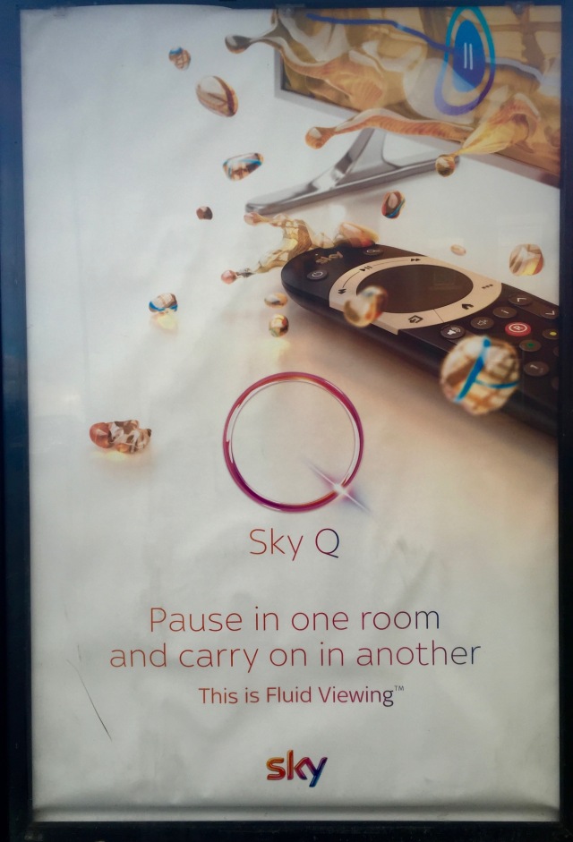
This advert is for a new service launched by Sky television: Sky Q. The linguistic message describes one of the features and benefits of the service, that the viewer can “pause in one room and carry on in another” this is topped by the words Sky Q and what appears to be a logo for the service, a large Q which appears futuristic and has connotations of space travel. The circle of the letter is broken by at the bottom right by a line that appears to be a bright light, this indicates speed of movement and is reminiscent of the way space craft in orbit moving at high speed are represented in science fiction which contains suggestions of being not only fast but futuristic. This new logo for the service is countered by the much smaller but also familiar Sky logo, that this is recognisable and trusted provides counterpoint to the unknown and untested new Q symbol and empowers it with a level of faith in the service being offered. In between, the message “This is fluid viewing” provides anchorage to the image presented at the top of the advert: a television form which bubbles of liquid are escaping across the mainly blank space ahead of it. (they have the appearance that liquids take on in zero gravity – which links to the futuristic/space age appearance of the Q logo.) Without the text we may struggle to identify what we are looking at, however, the term “liquid viewing” combined with the statement that we can “pause in one room and carry on in another” allow us to make sense that this is a metaphor for the natural yet futuristic service Sky are now offering. Below the television is a remote control which is both familiar and new to anyone who is aware of Sky’s current products. The controls used for Sky television would be familiar with the styling of their remote controls, and while the one represented here is similar it has enough difference to enable current customers to realise that this new service represents a continuation of what they are already familiar with while also being something new and interesting.
This advert is part of a larger campaign linked by the analogy of “liquid viewing” and focussing on the further benefits of the Sky Q service. On a basic level the ads are concerned with product awareness, further from that they work on the level of connotation to suggest the new television package is futuristic, space age, natural and organic to use. It appears that the advert is mainly targeted at existing customers, enticing them to sign up for the new service by showing ways it will improve their current experience. The subtle use of the new remote control here is both exciting and reassuring – it represents a continuation of what the customer already knows about the product and service while suggesting developments that it is desirable to take advantage of and be part of.
Thoughts…
I began this project buoyed with completion of the second assignment and with a set of new, self imposed rules about time keeping and limits of research. Unfortunately, I almost immediately broke these rules and found myself sucked down the familiar rabbit hole of masses of reading and note taking, albeit I managed to convince myself that this was a benefit. There are massive ideas within this project, studying Barthes alone proved a time consuming task and I decided to spend more time on this in the belief it will be of benefit for the rest of the section as his writings are used for another three projects. Semiotics is also an enormous and complex subject area and one that I am being unrealistic about if I believe I can gain a handle on it through this project. The majority of my notes fell under these broad headings which led to an element of confusion when I came to write my notes as I was not disciplined enough to keep on topic.
So what now? Again I will attempt to reign myself in and work in a more concise manner. The words of advice given by a fellow UVC student in recent email correspondence resonate with me: “I think we cannot cover all the important reading for a certain subject but to open windows for future enquiry. There are whole courses developed for every theme in some universities and those might take several months.” This is exactly what I have been telling myself, somehow hearing it from someone else helps however. So, plans going forward:
- Set a deadline, but make it realistic. A book about time management I read a while ago talked about how we often set unrealistic deadlines which are rarely if ever achieved and recommended doubling the timescale that is initially arrived at.
- Be more concise with note taking. This is what is taking up the majority of my time – I need to spend more time analysing what is important in the material I am reading and noting this down.
- Break projects down into more manageable pieces. My practice up until now has been to do all my reading and then start to write up. I am increasingly finding however that the process of writing helps to solidify thoughts – the process of writing itself helps explore ideas.
- Write projects more in note form. I have often been too hung up on trying to present each project as if it is an essay which in turn has taken more time.
Bibliography:
Buchanan, I (2010) Oxford Dictionary of Critical Theory. New York: Oxford University Press inc.
Chandler, D. (2008) The Basics: Semiotics. Oxford: Routledge.
D’Alleva, A (2012) Methods and Theories of Art History (2nd Ed.) London: Laurence King Publishing
Evans, J. and Hall, S. (eds.) (1999) Visual Culture: The Reader. London: Sage
Hall, S (2011) This Means This This Means That: A User’s Guide to Semiotics (Second Edition) London: Lawrence King
Howells, R. Negreiros, J. (2011) Visual Culture 2nd Ed, Cambridge: Polity Press
Macey, D. (2000) The Penguin Dictionary of Critical Theory London: Penguin books
Pooke, G. and Newall, D. (2008) The Basics: Art History. Oxford: Routledge.
Sturken, M. and Cartwright, L. (2009) Practices of Looking: An Introduction to Visual Culture. Oxford: Oxford University Press
