Find three examples of work in which the work of others is incorporated.
Find three examples of work that appropriates, copies or references everyday objects and reuses them as works of fine art.
Appropriation art pushes the boundaries of our understanding of what art can be and very much depends on whether you subscribe to the notion that anything can be art. Appropriation artists are in direct opposition to ideas of artistic genius and even authorship, appropriation is about the concept and those who oppose appropriation art criticise that it is devoid of talent and even that it represents illegal theft. Most appropriation artists care little about this, in fact for many this is the very point of their work. Appropriation can be defined as the act of borrowing, stealing or taking over others works, images, words and meanings for ones own ends, including amongst other things; recontextualisation, pastiche and referencing. (Sturken and Cartwright, 2009) Appropriation is frequently pervasive with postmodern art and culture and is the borrowing of ideas or images and incorporating them into new representations or objects. (Pooke and Newall, 2008)
In the early twentieth century, Marcel Duchamp challenged the very nature of art with his ready made urinal sculpture ‘Fountain’ (1917). To be successful however, the concept that anything can be art if the artist says so requires others to agree. It was not until the 1960s that this really became the case when pop art explored themes of consumerism, the banal and embraced what was deemed low culture. A decade later the idea began to gain real traction with postmodern artists like Sherrie Levine who took the work of another artist, rather than an everyday object like DuChamp, and presented it as their own work. An approach which challenged the value of art, originality and the myth of artistic genius rather than what art can be.
For the purposes of this assignment I have chosen work that is unified by having been made consciously as the work of an artist rather than looking at how artworks can become significant culturally and their meanings changed through the way they are used. I have chosen the artists and artworks here based on my own interest rather than trying to make some wider comment about what appropriation is in modern art. I have tried however to make a selection that enables discussion of different aspects of what appropriation can mean, as well as the many ethical and legal difficulties this can present.
Richard Prince: New Portraits (2014)
‘New Portraits’ is a series of screen grabs taken from Instagram and ink jet printed onto 6 foot canvasses. Prince experimented with various printing techniques before deciding upon the canvass as the way he wanted to present the series, the surface was tightly wound giving the canvas almost the appearance of photo paper. The printing process meant the whites were brilliantly white and colours intense, saturated and rich. The way the ink fused with the canvas also made the image slightly out of focus: “When I first saw the final result I didn’t really know what I was looking at. A photographic work or a work on canvass?” (Prince, 2015)
Hannah Jane Parkinson (2015) is less enthusiastic about the final effect achieved, she regards the quality as awful, “The text of the comments in particular is so blurry it feels like I’m looking through contact lenses clouded by having slept in them.” Although she does concede this is hardly surprising as iPhone screenshots were hardly intended to be blown up to this size. This is part of the meaning of ‘New Portraits’ however, not only are images not intended to be shown in a gallery setting but they were never meant to have any sort of existence other than a digital one. Indeed, one of the criteria Prince uses when choosing which images to appropriate is that they would only appear, or better still exist, on Instagram. He shows (perhaps wilfully) his age and separation from the young people for who an online existence is so natural they could be termed ‘digital natives’ – he refuses to use the term selfie: “Selfies? Not really. Self-portraits. I’m not interested in abbreviation.” And quaintly thinks that Tumblr is spelt tumbler. By presenting ‘New Portraits’ in this way, Prince confronts questions about art, ownership, voyeurism, identity and image projection in the twenty-first century.
Prince describes his arrival at ‘New Portraits’ as a natural progression in his work. In 1984 he made portraits by asking friends to select five images of themselves and give them to him, he would then select and rephotograph one. This had many advantages, the friends did not need to sit for their portrait and they were guaranteed to like the chosen image as they had provided it themselves. He admires Larry Clark, Diane Arbus and Robert Mapplethorpe, but concedes he would not know where to begin to take a great portrait, he has tried but did not enjoy the experience, he feels more comfortable in his bedroom looking through other peoples pictures: “Looking. Wondering. Anticipating. Hoping. What will be on the next page.”
Before arriving at Instagram Prince experimented with Twitter. He made a series of text/tweets called ‘The Family’, 36 photographs of his extended family, captioned with a short description then inkjet printed. Although he liked twitter it is mainly text based and he wanted to combine images and words, which is how he came upon Instagram: “if Twitter is editorial…then Instagram was advertising.” The iPhone became his studio as he began to explore what was available. He started looking at the Instagram accounts of people he knew, and was soon led down a “rabbit hole” where he would check out new Instagram accounts based on who these people were following and their likes. He describes this as a psychedelic, out of body experience, “where you suddenly look at the watch and it’s three in the morning.” He struggles to articulate why he chooses the pictures he does, but sees similarities to a previous series where he made paintings of jokes – he would read a joke book and if he found one out of 101 it is a good day:
“People on IG lead me to other people. I spend hours surfing, saving, and deleting. Sometimes I look for photos that are straightforward portraits (or at least look straightforward). Other times I look for photos that would only appear, or better still . . . exist on IG.”
When deciding how to present ‘New Portraits’, Prince was unsure, although he was definite about what he did not want to do: he did not want to do anything physical to the photograph, whatever he wanted to do needed to happen inside the photograph. When screen saving an Instagram image you get three or four comments along with the person’s profile (which he felt was important to include.) He not only wanted to add his own comments to feature and be his contribution to the piece but often found his comments would appear out of frame, at the bottom due to the many comments that had already been made. By accident he hit upon a system where he could manipulate the screen shot to include his comments – if he reported those above as spam they would disappear which would enable him to get the effect he was after. The style of the comments he makes is deliberately obtuse and unintelligible, a mixture of nonsense and the seemingly profound. He calls the technique ‘birdtalk’ and it is also the system he uses on Twitter: ” Short sentences that were funny, sweet, dumb, profound, absurd, stupid, jokey, Finnegans Wake meets MAD magazine meets ad copy for Calvin Klein.” The irony is that presented next to other Instagram users comments the absurdity of his words do not seem at all out of place.
Richard Prince is no stranger to accusations of theft and even litigation, most notably being sued by the photographer Richard Cariou when he rephotographed Cariou’s images and slightly modified them for his ‘Canal Zone’ series. Initially the court ruled in favour of Cariou, but Prince was deemed not to infringed copyright on appeal. Prince has consistently (and in typical style) said that copyright does not interest him and that it never even occurs to him to ask for permission. He also comments wryly that others have only become interested in copyright infringement as his success, and wealth, has grown. “For most of my life I owned half a stereo so there was no point in suing me, but that’s changed now and it’s interesting.” (Crockett, 2015)
The alternative modelling collective Suicide Girls responded to being appropriated by Prince for ‘New Portraits’ in pragmatic fashion – rather than threatening legal action (an approach they both could not afford and had little chance of success given the Cariou case) they decided to play Prince at his own game and offer the same images he has used for a $90 rather than $90,000. Like Prince, the comments section was used to change each picture, they added the comment “true art” to each one before printing the screen shots in exactly the same way and at the same size that Prince had. On the Suicide Girls website, co-founder Selena Mooney (aka Missy Suicide) comments that this is not the first time their images had been used without permission for commercial gain, what she objects to in this instance however is the inflated prices that the pieces are selling for and how this is an example of art being put out of the reach of normal people like her for whom the only thing they would spend $90k on would be a house. Of course selling the same images at 99.9% off their original price succeeds as a means of generating publicity, and most likely revenue, for the Suicide Girls website and brand. It does nothing to alter the value of the ‘original’ Richard Prince work, what you are buying for $90 is not the work of an internationally renowned artist who has been validated by the market and thus deemed to be able to command these astonishing prices, but a copy which is only worth the $90 it sells for.

Mishka Henner: Less Américains (2013)
If ‘New Portraits’ represent an established artist elevating the banal and throwaway then ‘Less Américains’ shows an emerging artist appropriating an admired classic. Robert Frank’s 1958 ‘The Americans’ is regarded as the ‘bible’ of photobooks, completely revered in photographic circles and beyond criticism. The title is a pun on ‘Les Américains’, the first edition of the photobook which was published in French because Frank could not find a US publisher – a reminder of how favour and fame can change dramatically over time. ‘Less Américains’ could be described as a ‘remix’ of ‘The Americans’, the 83 images from the original shown in the same sequence, except Henner has digitally erased parts of each photograph leaving only outlines and white space where there were once faces, bodies, graphics and flags. By doing this Henner tackles a number of conceptual themes: the fetishisation of vintage work, notions of authorship and ideas about memory – despite being created from some of the most famous photographs of all time some of the pictures are almost unrecognisable in their abstraction.
‘Less Américains’ is not only a comment on photography but also asks questions about the photobook as an art form that is experiencing a period of huge popularity that shows no sign of diminishing any time soon. The book itself features the images sequenced in the more well known Steidl edition rather than the original French version, except for the cover which echoes ‘Les Américains’. The essay by Jack Kerouac that introduces the book is included although in Henner’s version most of the words are blanked out making the text incomprehensible – the essay is also now credited to artist Elisabeth Tonnard with no mention of Kerouac. Henner chose to self publish the book using print on demand technology which allows him to fulfil ‘Less Américains’ as a physical object with all the gravitas that entails while ironically not requiring the approval of a traditional publisher.
The development of Henner as an artist is interesting and gives insight into his motivations for creating ‘Less Américains.’ He originally studied sociology and was drawn into photography after seeing the 2003 Tate exhibition ‘Cruel and Tender’ and being inspired by the work of the Dusseldorf school of photographers who elevated the seemingly ugly and banal, such as industrial estates, into the profound. He started working as a traditional documentary photographer on long term projects in London and Manchester and was just starting to make a name for himself in this field he dramatically changed direction and embraced conceptual art. He was motivated to reach an audience outside of what he saw as the conservative and narrow world of photography concluding that the documentary work he had been producing had little to do with the truth.
The inspiration for ‘Less Américains’ came from what Henner saw as the creative/destructive relationship demonstrated by Robert Rauschberg’s 1953 work ‘Erased de Kooning Drawing.’ Similarly to Rauschberg, Henner feels he is creating something new from Frank’s photographs through his process of digital erasure. Unlike Rauschberg who completely removed all traces of De Kooning’s sketch without even taking a photograph of it, Henner is using Photoshop to alter a facsimile of the original images which remain untouched. His working methods were to take several months experimenting with erasing different parts of the photographs and meditating on what the results mean both aesthetically and conceptually. He likened this to the way a painter works, playing with shape and texture. For me the work forces close examination of the images and for me to question not only what I am seeing but also my ability to remember, on the one hand the Henner’s images seem recognisable and yet they are also definitely new works. Despite thinking that I know ‘The Americans’ well, some of Henner’s pictures are only recognisable when viewed alongside the source material.. Sean O’Hagan describes them as more like “surrealist puzzles than photographs” and the only reason they are controversial is because of the source material. (O’Hagan, 2012)

Adam Curtis: Bitter Lake (2015)
Adam Curtis describes himself as a journalist who makes films for television (Harris, 2015) but his brand of journalism is not something that is instantly recognisable. His films defy classification: they are history, current affairs, polemic, experimental and opinionated. For more than 20 years he has been producing films that are unified by being made entirely of found, archive footage which is matched with a distinctive narration from Curtis himself, described by Sam Wollaston as “schoolmasterly in tone and apocalyptic in message.” (Wollaston, 2015)
Curtis has long been interested in the way the world is understood and journalisms relationship to this. Among the many themes in his work, it could be argued that exploring this relationship is his main preoccupation. For Curtis, while the world has become seemingly more difficult to understand, current affairs are presented in increasingly simplified terms – mainly as narratives of good versus evil. This is partly a considered strategy by those in power but also one that news organisations are complicit with, he believes that modern news programming and presentation is not conducive to dealing with the complex situations of the modern world which in turn leaves those in power unaccountable and is bad for democracy. Not understanding the mistakes of the past is a concern for Curtis and one he uses Bitter Lake to address – he proves his thesis by demonstrating that a number of major concerns for us the modern world from Islamic radicalisation, terrorism, the war in Afghanistan and the banking crisis, can be traced back to events set in motion in 1945 and a meeting between President Roosevelt and King Abdulaziz, founder of Saudi Arabia, aboard a warship on the great Bitter Lake in 1945.
Bitter Lake is made up almost entirely of archive footage, mainly (but not exclusively) unedited rushes from BBC journalists in Afghanistan. The war in Afghanistan is the centre point of the film and Curtis uses this to prove his assertion that by not understanding the mistakes of the past we continue to repeat them. Because Curtis is famous for using found footage Jon Ronson imagines him holed up in a darkened room in some corner of the BBC, searching through hours and hours of forgotten videotape looking for some sort of marriage between his ideas and the pictures shot by others. The truth is slightly more boring, there is no special room only a giant open plan BBC office in London where he watches archive films ordered from anonymous warehouses. His choices are guided by instinct, he looks for a mood that he sees present in the films that can be used to give force to the arguments he wishes to make. This is the antithesis of what we understand as objective journalism – the concept that the world is shown to us exactly as it is, without prejudice or agenda – Curtis makes no attempt to hide the fact that what he is presenting is his world view. From the outset Curtis approaches his work from the opposite end of the spectrum – he already knows what he wants to say and he is searching for ways this can be shown. His view is that there is too much reliance on journalists presenting television and film as literal.
Curtis has an interest in forgotten images, archives and what he calls “hidden material.” This led him into contact with BBC cameraman Bill Goodwin who brought back to London hundreds of thousands of digitized rushes from the BBC station in Kabul – which represents most of what the organisation would have shot in Afghanistan. Goodwin found that no one at the BBC was interested and gave the footage to Curtis who was fascinated by the material, from which 10/20 seconds at most is used for broadcast and much of which had never even been watched back. He found much of the footage extraordinary and was immediately struck by how at odds this was with the simplistic stories that were presented about Afghanistan. This crystallized his opinion that it is not the journalists on the ground who are the issue but the news organisations and the way they choose to use, or not use, their work. For him these journalists are the heroes of Bitter Lake: brave and intelligent people working in difficult situations to trying and make sense of complex situations and he was conscious about not wanting to embarrass them through his use of unedited material.
The way Bitter Lake unfolds is unlike anything else and defies categorisation as either current affairs, documentary or art house cinema – there are elements of all of these in the work. Despite Curtis’s narration providing a strong narrative tie to the images, perhaps half of the film has no dialogue at all which is at first disconcerting and gives a dreamlike feel. Often we are unsure of what we are watching as we have become so used to tight editing that tells us how to react. Sometimes an extended scene is nothing more than a beautiful aside, the shots held longer than we expect having a mesmeric effect. At other times, the seemingly innocuous is transformed by a sudden, brutal act of violence – as a viewer, without the signposts we have become accustomed to seeing the effect is overwhelming. Curtis does not just use archive news footage however, the Tarkovsky film ‘Solaris’, ‘Carry On Up the Khyber’, ‘Blue Peter’ and the Afghan version of ‘The Thick Of It’ are all used almost as a way to make it clear that this is not a typical piece of journalism we are witnessing. ‘Bitter Lake’ is not only original in itself but also has not taken the traditional approach to broadcast being shown only via the BBC iPlayer. Some commentators have been disparaging of this saying that the BBC is showing a lack of faith in the project by not giving it traditional broadcast. Curtis himself sees iPlayer as the perfect way he can present this experimental work outside the confines of normal broadcast, hinting that without the innovation he would not have been able to make the film he envisaged. It is true that it is difficult to see how such a long and complex work could fit into what we traditionally understand as documentary broadcasting.

Vik Muniz: Pictures of Garbage (2009)
Vik Muniz is a Brazilian born artist who is famous for appropriating famous images and art history and popular culture and reworking them using everyday materials before photographing the results. He could be described as a photographer but his work is often a mixture of drawing and sculpture with photography being used to record the final result. For example, ‘Action photo, after Hans Namuth’ (1997) is a recreation of the famous photograph of Jackson Pollock in his studio producing his iconic action portraits, but rendered using Bosco chocolate syrup. Muniz first experiment with this technique was following a project he undertook documenting sugar plantation workers on the Caribbean island of St. Kitts. Originally he intended the work to be a series of photographic portraits but was inspired to ‘draw’ images of the workers and their children using sugar and then rephotographing the results. ‘Sugar Children’ (1997)
His series ‘Pictures of Garbage’ represents an altruist break for Muniz, he describes reaching a point in his career where he wanted to step away from the fine art world and give something back, coming from a poor family he realised that it was only luck that had led to his success and with a twist of poor fortune he would have never have been able to achieve the lifestyle he had achieved. He was drawn back to Brazil and specifically to Jardim Gramacho – a huge 32 acre open air landfill site outside Rio. The waste is picked over by an informal workforce of Catadores (waste pickers) who make a living by reclaiming and recycling useful items from the dump. Muniz expected the Catadores, people at the extreme end of consumer culture, to be beaten and broken. Instead he found survivors. This changed his approach, instead of painting portraits he began a collaboration with some of the workers: first he would photograph them in a scene inspired by classical art before recreating these images in his studio using rubbish from Jardim Gramacho. The Catadores became Muniz’s art assistants; picking rubbish from Jardim Gramacho and transporting to Muniz’s studio where he directed them from a platform to produce sculptures before capturing the finished work as a photograph. There is an interesting irony in the use of rubbish here: the Catadores scavenge for items in the dump that have value or can be reused – an enterprise which takes huge effort for small reward. In collaboration with Muniz, the sculptures and subsequent photographs they make have no use value and yet the finished work sells for tens of thousands of dollars on the art market.
The project was also made into a documentary film ‘Wasteland’ (2010, dir: Lucy Walker) in which the humanity of the Catadores and their impressive resilience really comes through – despite their apparent desperate situation living in abject poverty literally in rubbish they are positive, likeable and driven to make their lives a little better, for example Zumbi who educates himself with the books that have been discarded in the tip as well as using these to set up a library for his co-workers. At the end of the process, the workers/art assistants attend the opening of the exhibited works at Rio’s Museum of Modern Art with Muniz and he donates all proceeds from the sale of the work to the workers cooperative. It is a feel good ending despite the fact that the very next day the Catadores will be back amongst the garbage, trying to provide themselves with some sort of living and existence. This has led some to criticise Muniz for at best being naïve in his intervention and at worst exploitative. To me he is an idealist, driven by the need to use his success to do some good in the world and particularly the country of his birth which is clearly faced with many challenges. Can art really change the world? I am not so sure, I do however admire Muniz’s need to try and make a difference, especially in this practical way that enables the Catadores to be collaborators in the project rather than recipients of handouts and pity. Whether this seemingly non political approach does anything to make real lasting changes I am not sure, I am also not sure how Muniz would go about achieving this or even if it would be desirable for him to do so.

Broomberg and Chanarin: Holy Bible (2013)
Adam Broomberg and Oliver Chanarin have worked together since the early 1990s, their politically motivated, conceptual and thematically designed projects developing in steady continuation since then. In 2008 the pair spent time embedded with the British army in Helmand Province, Afghanistan and their practice has focused increasingly on the depiction of war since then. The output of their experience was typically conceptual as they left their cameras at home and chose to ‘document’ events by exposing 50m long pieces of photographic paper to the Afghan sun. The project culminated in an exhibition ‘The Day Nobody Died’, a nod to the fact that their time in Afghanistan coincided with the deadliest month of the entire war. The project is definitely anti-mainstream war photography, that does not mean they do not respect those who choose to document war zones and are willing to pay the ultimate price like Tim Hetherington and Chris Hondros who they describe as a different breed. They are only interested in visiting conflict zones to explore ideas about how human suffering is documented and then consumed as images and how individuals respond to this. They see the debates about photography and its relationship to truth and authenticity to be arguments that are long over, the only question that remains is what constitutes evidence. Against charges that their work is anti-photojournalism they respond that it is not, but it is anti-empathy.
Their ‘Holy Bible’ project follows directly from their previous work, the 2013 Deutsche Börse prize winning ‘War Primer 2’. For this they reinterpreted Bertolt Brecht’s original ‘War Primer’ – a 1955 book in which he coupled newspaper clippings with his own four line poems, keeping Brecht’s original text but matching them with contemporary images of the war on terror. While researching ‘War Primer 2’ they came across Brecht’s personal Bible in which had placed clippings and small annotations after running out of notebooks – the proved to be the genesis of the ‘Holy Bible’. At the same time they came across, and were deeply influenced by, the writings of Adi Ophir – a radical Israeli philosopher with particular expertise in the Old Testament. His book ‘Divine Violence’ (a section of which provides the afterword of the Holy Bible) draws parallel between the violence of The Bible and the violence of the modern world and reads it as a parable for modern governance and its relation to catastrophe and punishment. This struck a chord with Broomberg and Chanarin and their interest in how photography is used to understand the world and yet is often drawn to power, war, catastrophe and sites of human suffering.
Broomberg and Chanarin’s ‘Holy Bible’ contains images sourced from the Archive of Modern Conflict superimposed over a reprint of the King James version of the Old and New Testaments. Each of the 512 images are accompanied by text underlined in red which not only provides a new caption for the images but also a strange narrative throughout – one which is very much open to individual interpretation however. The Archive spans the history of photography and provides an unofficial version of the history of war which is opposite to the straightforward narratives we have come to expect. For example, there are shelves containing the personal albums of Nazi soldiers that contain pictures showing familial intimacy, human emotions, tenderness and desire – all counter to the narrative we are used to seeing and morally difficult to cope with. Although the time they spent in the archive was difficult and depressing spending so much time around images of suffering and death they also came across humour. They found a large collection of photographs of magic tricks and used these as a running motif throughout, almost to punctuate and relieve the horror of the disturbing images of death and destruction that are also contained. Each of the magic images are combined with the phrase “and it came to pass” which provides a running motif and strange kind of punctuation throughout.
Can the Bible be seen as an everyday object? It remains the best selling book of all time but perhaps the time where it is the centre point of many peoples lives is gone – although it undoubtedly is hugely important to Christians all over the world and Broomberg and Chanarin’s appropriation of the sacred text could be seen as provocative at the very least and blasphemous by many. The work is fundamentally an object and requires experiencing the artefact itself to understand and disseminate. Much can be gained from the tactile feel of the book, I am not a religious person but holding Broomberg and Chanarin’s Holy Bible instantly transported me to school assemblies, weddings, funerals and christenings – the Christian touch points of my life. Apart from the names of the artists on the spine and the publishers name on the back, to all intents this is a real bible with embossed gold text and a cover with a texture that gives the feel of imitation leather. The pages are gold edged and there is a familiar red bookmark ribbon down the centre. For me the feel of the paper is the most tactile, it is a strange thin but strong paper that almost has the feel of tissue which I have only ever experienced in a Bible. The book somehow demands to be red from cover to cover, the obstruction of the text by the images make reading it as an actual bible impossible. The highlighted text seems captions each image but the connections are not obvious although they seem to form some sort of narrative, albeit with oblique and possibly personal meaning. The initial feeling I have when looking through the book cover to cover is to question the truth and meaning of what I have seen, not being overtly told how I need to respond to the images provides a puzzle and leads me to questioning old notions of truth and objectivity – the apparent hallmarks of photojournalism. It is also a physical struggle to get through with every page demanding attention and thought to link what has gone before – not to mention the length. I wonder what the archives of the future will look like, in the age of citizen journalism when anyone and everyone record almost every moment of their lives and experience how do we log and make sense of this? Despite this seemingly improved way of collating images the same old eco system of photo journalism driven by editors who are increasingly accountable to ad agencies and revenues prevails. Perhaps the only question remaining is the one that Broomberg and Chanarin ask with the Holy Bible: what constitutes evidence?
 Miriam Elia: We Go To The Gallery (2014)
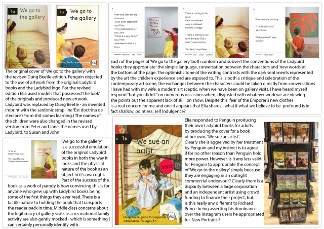
I have chosen to include ‘We Go To The Gallery’ by Miriam Elia for a number of reasons: I have owned the book for a while and it is a work I admire, the object itself is a convincing imitation of the Ladybird books I read as a child, it contrasts starkly with Broomberg and Chanarin’s ‘Holy Bible’, the threat of litigation by Penguin books and Elia’s response is interesting, and, unlike the other works I have chosen which are all quite serious, it is funny!
‘We Go To The Gallery’ is a parody of the Peter and Jane Ladybird books of the 1960s and 70s and pokes fun at the contemporary art world – the innocence and old fashioned optimism of Peter and Jane contrasting in amusing ways with the nihilism of the modern art scene. The book is instantly recognisable as the Ladybird books it pastiches, the size, printing, choice of paper, design, artwork and style of writing are all instantly familiar to anyone for whom the original ladybird books formed part of their childhood. For the first edition, a print run of 1000 funded by £5000 raised on Kickstarter, Elia used the Ladybird logo on the cover, thoughts of copyright did not occur to her because she was producing an artwork. When the project gained attention on social media, Penguin books, who own Ladybird imprint, sent legal letters stating that Elia was infringing their copyright and ordered her to pulp the remaining books. Elia obliged but then went on to rework her original changing the artwork and the children’s names to Susan and John and inventing her own publishing imprint, Dung Beetle books, in place of Ladybird. The new artwork was achieved using models from a modelling agency with the “right look” and dressing them in period clothes before enacting the scenes. The second edition of 5000 has now sold out and a more affordable mass market edition of 20 000 is now selling well.
Penguin made no attempt to take legal action about the second edition. Instead, possibly ‘inspired’ by the success of ‘We Go To The Gallery’ they released their own Ladybird books for adults in October 2015, eight titles including The Hipster, The mid-life crisis and The Hangover. Elia responded with a mock up cover on her website for a book she may produce in the future: ‘We Sue An Artist’ and a printed response available on her website and published in The Guardian. With typical sardonic tone she reasons that Penguin were right to produce the new Ladybird books as independent artists are worthless to the economy, unlike Penguin who employ more people, who will feed more children, who will be able to buy Ladybird books. Also, and for me most cuttingly the “new books clearly demonstrate that it is the working class, not the intelligentsia, who present the greatest hazard to our cultural, artistic and political heritage.”
Bibliography:
Armistead, C (2015) The flyaway success of the Ladybird art prank. The Guardian, 2nd September 2015. Available at http://www.theguardian.com/books/2015/sep/22/the-flyaway-success-of-the-ladybird-art-prank?CMP=Share_iOSApp_Other [accessed November 2015]
Bennett, Tony; Grossberg, Lawrence; Morris Meaghan (Eds.) (2005) New Keywords: A Revised Vocabulary of Culture and Society, Wiley-Blackwell, Revised Edition
Buchanan, I (2010) Oxford Dictionary of Critical Theory. New York: Oxford University Press inc.
Burke, J. (2015) The Great Game: Adam Curtis’s Bitter Lake. Sight and Sound, June 2015.z Available at http://www.bfi.org.uk/news-opinion/sight-sound-magazine/reviews-recommendations/tv/great-game-adam-curtis-s-bitter-lake?utm_content=bufferbb4b8&utm_medium=social&utm_source=twitter.com&utm_campaign=buffer [accessed January 2016]
Caspar, J. (ND) Less Américains – concept by Mishka Henner. LensCulture.com. Available at https://www.lensculture.com/articles/mishka-henner-less-americains [accessed January 2016]
Chayka, K. (2015) Richard Prince’s Instagram Theft Ignite Debate Over Social Media Ownership. Vulture.com, May 28th 2015. Available at http://www.vulture.com/2015/05/did-richard-prince-steal-from-instagram.html [accessed November 2015]
Crockett, Z. (2015) The richest photographer in the world. Priceonomics.com, December 4th 2015. Available at http://priceonomics.com/the-richest-photographer-in-the-world/ [accessed December 2015]
Curtis, A (2014) BBC Blogs: Trailer Trash. Available at http://www.bbc.co.uk/blogs/adamcurtis/entries/ae14be85-3104-3c74-a9da-85807434a38e
Elia, E and M (2015) Our Response to the new Penguin books. The Guardian, 18th October 2015. Available at http://miriamelia.co.uk/our-response-to-the-new-penguin-books/ [accessed February 2016]
Evans, D. (Ed.) (2009) Appropriation. London: Whitechapel Gallery Ventures Ltd.
Feurerhelm, B (2013) Broomberg and Chanarin Discuss God, Human Suffering and the Act of Divine Violence. American Suburb X, May 20th 2013. Available at http://www.americansuburbx.com/2013/05/asx-interview-broomberg-chanarin-divine-violence-2013.html [accessed June 2015]
Kino, C (2010) Where Art Meets Trash and Transforms Life. The New York Times, 21st October 2010. Available at http://www.nytimes.com/2010/10/24/arts/design/24muniz.html [accessed February 2015]
Harris, B (2015) Remixing the BBC. The New Yorker, 11th February 2015. Available at http://www.newyorker.com/culture/culture-desk/remixing-bbc [accessed January 2015]
Harrison, N. (2015) In the wake of the Richard Prince and Instagram, revisiting copyright law, appropriation and history. American Suburb X, 4th June 2015. Available at http://www.americansuburbx.com/2015/06/in-the-wake-of-richard-prince-and-instagram-revisiting-copyright-law-appropriation-and-history.html?fb_ref=79ed34329a7a47f188fff1585924fc5f-Twitter [accessed September 2015]
Heinz, L (2013) Adam Broomberg and Oliver Chanarin. British Journal of Photography, June 2013, pp. 40-43
Howells, R. Negreiros, J. (2011) Visual Culture 2nd Ed, Cambridge: Polity Press
Jones, A (2014) ‘Mummy, I could have done that’ – new book pokes fun at modern art. The Independent, 6th February 2014. Available at http://www.independent.co.uk/arts-entertainment/art/features/mummy-i-could-have-done-that-new-book-pokes-fun-at-modern-art-9112523.html [accessed February 2016]
Ladd, J. (2012) Retouching a classic: ‘Less Américains.’ Time, March 22nd 2012. Available at http://time.com/39008/retouching-a-classic-less-americains/ [accessed January 2012]
Ladd, J. (2013) The Holy Bible Appropriated: An Illustrated Scripture by Broomberg and Chanarin. Time, 6th June 2013. Available at http://www.americansuburbx.com/2013/05/asx-interview-broomberg-chanarin-divine-violence-2013.html [accessed January 2015]
Moakley, P (2011) Portraits with Purpose: Vik Muniz in Waste Land. TIME, 22nd March 2011. Available at http://time.com/3775724/portraits-with-purpose-vik-muniz-in-waste-land/ [accessed February 2016]
Muniz, V (2012) Boston University Contemporary Perspectives Lecture Series. Available at http://time.com/3775724/portraits-with-purpose-vik-muniz-in-waste-land/ [accessed February 2016]
Needham, A (2015) Richard Prince V Suicide Girls in an Instagram Price War. The Guardian, 27th May 2015. Available at http://www.theguardian.com/artanddesign/2015/may/27/suicide-girls-richard-prince-copying-instagram [accessed November 2015]
O’Hagan, S. (2012) Mishka Henner’s erased images: art or insult? The Guardian, 23rd May 2012. Available at http://www.theguardian.com/artanddesign/2012/may/23/mishka-henner-less-americains [accessed January 2015]
O’Hagan S. (2013) Deutsche Borse 2013: Broomberg and Chanarin’s Holy Bible. The Guardian, 11th June 2013. Available at http://www.theguardian.com/artanddesign/2013/jun/11/deutsche-prizewinners-new-work-holy-bible?CMP=Share_iOSApp_Other [accessed October 2015]
Parkinson, H. Instagram, an artist and the $100,000 selfies – appropriation in the digital age. The Guardian, 18th July 2015. Available at http://www.theguardian.com/technology/2015/jul/18/instagram-artist-richard-prince-selfies?CMP=Share_iOSApp_Other [accessed January 2016]
Pantall, C. (2012) Less is More. British Journal of Photography, April 2012.
Perry, G. (2014) Playing to the Gallery London: Penguin Books
Pooke, G. and Newall, D. (2008) The Basics: Art History. Oxford: Routledge.
Prince, R. (2015) New Portraits (press release) Available at https://www.gagosian.com/exhibitions/richard-prince–june-12-2015 [accessed January 2016]
Ronson, J (2015) Jon Ronson in Conversation with Adam Curtis. Vice.com, 5th January 2015. Available at https://www.vice.com/en_uk/read/jon-ronson-interviews-adam-curtis-393 [accessed January 2015]
Rubin, G (2014) Artist’s spoof Ladybird book provokes wrath of Penguin. The Guardian, 2nd March 2014. Available at http://www.theguardian.com/books/2014/mar/02/artist-ladybird-book-penguin-copyright-miriam-elia [accessed February 2016]
Saltz, J (2014) Richard Prince: Pervert, Troll, Genius. Vulture.com, 23rd September 2014. Available at http://www.vulture.com/2014/09/richard-prince-instagram-pervert-troll-genius.html# [accessed November 2015]
Schjeldahl, P (2014) Richard Prince’s Instagrams. The New Yorker, September 30th 2014. Available at http://www.newyorker.com/culture/culture-desk/richard-princes-instagrams [accessed January 2016]
Seymour, T. (2014) The Dodo Effect. British Journal of Photography, August 2014, pp. 58-61
Shore, R. (2014) Post-Photography: The Artist With A Camera. London: Robert King Publishing
Sturken, M. and Cartwright, L. (2009) Practices of Looking: An Introduction to Visual Culture. Oxford: Oxford University Press.
Walker, L (2010) Wasteland
Williams, R. (1983) Keywords: A Vocabulary of Culture and Society. London: Fontana Press.
Wollaston, S (2015) Bitter Lake Review. The Guardian 26th January 2015. Available at http://www.theguardian.com/tv-and-radio/2015/jan/26/bitter-lake-review-adam-curtis-afghanistan [accessed January 2016]


